drawing comics in adobe illustrator - part one
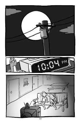 this is a sample page from my self-published comic, "ang maskot", which i created entirely as vector art in adobe illustrator. the techniques i describe below were essentially made up as i bumbled along, so they may amuse and/or tick off any comics pros reading this.
so let's start off with brainstorming.
"ang maskot" began long ago with an overheard conversation about a friend who may or may not have dressed up as a mascot for a children's party--i'm a little fuzzy about the details. but eventually ideas started coming together in my head until one day i finally sat down and started drawing thumbnail sketches (if you can call 'em that):
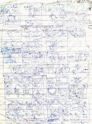 just quick scribbles on the cheap mini-intermediate pads i favor as scratch paper. plot, layouting, pacing, a smattering of dialogue... i lay things down so i won't forget later. and since i'm both writer and artist, the drawings only need to make sense to myself (but even there i've failed once or twice).
revisions start happening even at this earliest stage, and don't stop practically until final inks and colors. you shouldn't love your work so much that you stop trying to make it better.
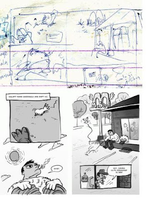 but then sometimes you get lucky on the first try. the first couple of pages went through hardly any changes at all!
 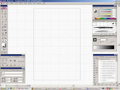 here's the method: i start drawing in adobe illustrator on a blank page 5.5 inches wide by 8.5 inches long-- the size of a sheet of letter-size bond paper folded in half.
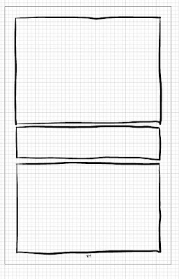 i use the grid as a guide and draw the panel borders by hand on my beat-up old wacom tablet. rulers are for pansies!
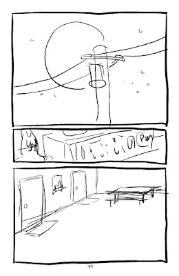 then i open up a separate layer and make the rough sketch based on the thumbnails. nice and sloppy, just the way i like it.
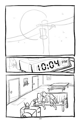 i lower the opacity of the sketch layer to about 20%, start a new layer and re-draw the lines with a little more effort. i prefer the 3-point brush tool with pressure sensitivity and zero smoothing. and if you think that's cheating, don't get me started on "undo", heh heh.
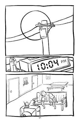 finished line art. i cheated on the moon. i drew a circle using the circle tool first and then traced over that with the brush.
 then i add the shading. i use the rectangle tool to fill entire panels; all else are hand-drawn shapes. i can use solid colors or gradients for any of the shapes. and since everything's vector i can move, resize and edit every stroke, shape and object to my heart's content.
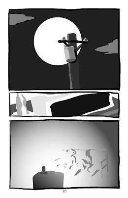 (a view of just the shading, without the lines. )
all that technology at his fingertips, you ask, and his drawings are still so crappy? well that, my friends, is another story.
edit- i made a crude animation of the above steps and posted it to my deviantart because blogspot doesn't support flash. you can see it here:


Comments
Post a Comment